Trade-a-Car Automotive
Marketplace Landing Page
Website Design


UI Designer
Figma, Photoshop, InVision
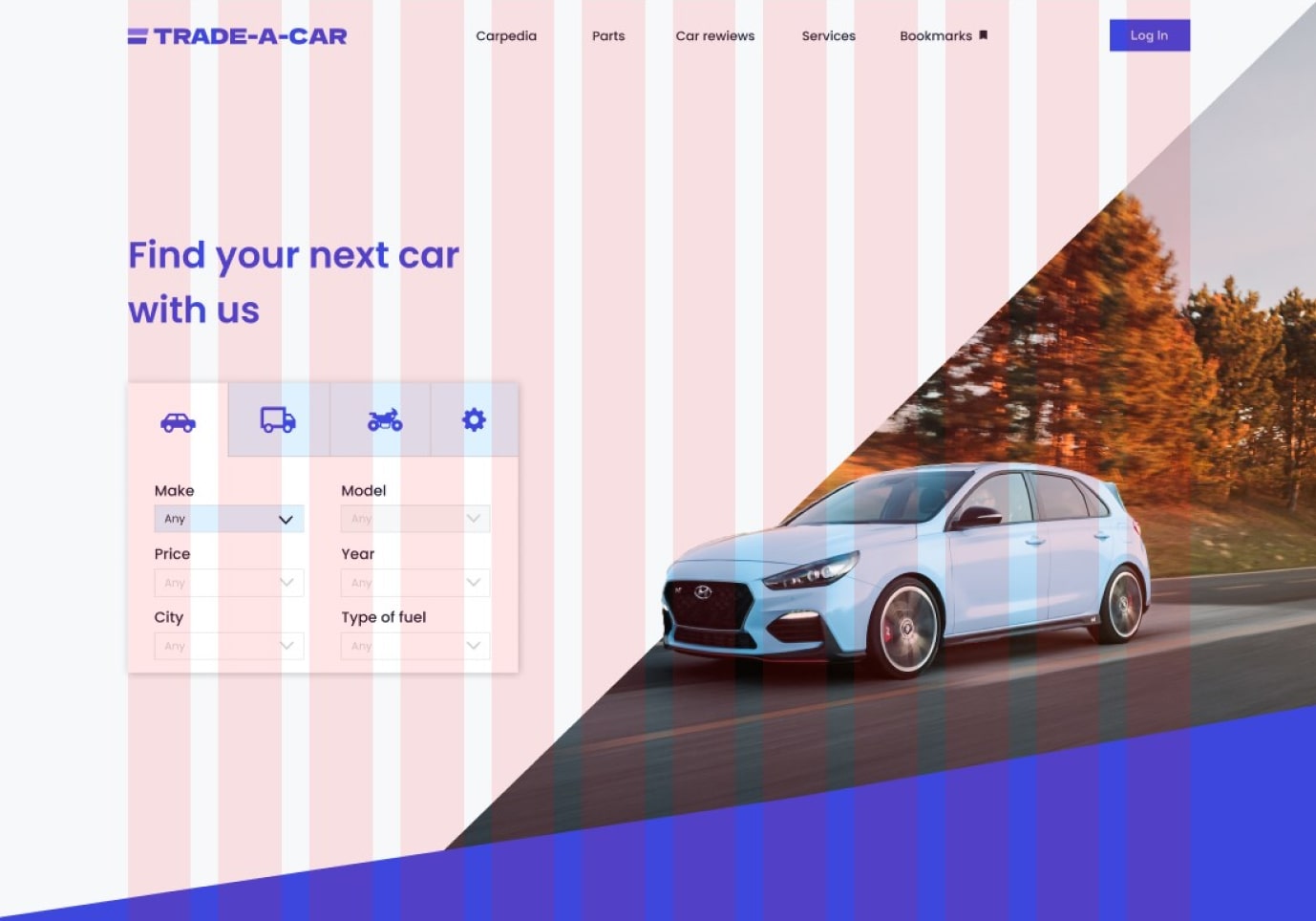
Trade-a-car is an e-commerce platform which I made for my design portfolio where consumers can buy and sell cars. The platform provides a user-friendly interface for customers to search and filter cars based on their preferences, such as make, model, year, and price range. The marketplace also provides detailed informations about the cars, including photos, descriptions, and technical specifications.The UI Design case study of this automotive marketplace focuses on the design process and the decisions made to create a seamless user experience for customers.
To understand the platform's target audience and the direction I should go with UI design, I created a persona. This helped me understand the needs, preferences and behaviors of my target audience and design a user interface that meets their needs.

John is a 35-year-old marketing manager who lives in an urban area. He has a high income and is looking to purchase a car for his daily commute. He is tech-savvy and uses the internet to research and compare different models before making a purchase. He values convenience and is looking for a platform that is easy to navigate and allows him to find the information he needs quickly.
Name: John
Age: 35
Occupation: Marketing Manager
Income: $75,000+
Location: Urban
- Find a car that meets his needs and preferences in terms of safety features, fuel efficiency, and price range
- Compare different models and prices from different manufacturers
- Find a platform that is easy to navigate and provides detailed information about the cars
- Having difficulty finding a car that meets his needs and preferences
- Being overwhelmed by the amount of information available on different platforms
- Frustrated by difficult navigation and poor user interface design
For inspiration, I created a moodboard. The goal was to provide me with a clear visual representation of the aesthetics and style of the project and the design process.I collected screenshots of a real-world automotive websites. I also used Behance and Dribbble for inspiration.

UI card for car search
Two quadrilaterals used in logo
Photo of the car as the main object
Sharp edges used in design
Again a photo of the car as the main object on the right side
Marketing message on the left side wtitten in bold letters
 View the UI Board (InVision)
The color palette is primarily composed of shades of blue and gray to give a professional and honest look. According to color theory blue represents trust, loyality and professionalism. Gray represents wisdom and dependability. Also it is generally believed that blue is one of the most universally liked colors across cultures and demographic groups.


As a typeface I used Poppins. As Google Fonts describes it “Poppins is one of the Geometric sans serif typefaces have been a popular design tool for building websites. Each letterform is nearly monolinear, with optical corrections applied to stroke joints where necessary to maintain an even typographic color.” It’s a very popular and aesthetically looking typeface.


For icons I chose available via Figma plugin called Iconify. As color for the icons I used bright blue and navy blue.
When designing the buttons I applied sharp corners to remain consistensy in design. Also I used sufficient contrast. According to WCAG 2.0 recommendations, the contrast ratio should be at least 4.5:1. For the buttons I used Space Grotesk typeface.

The logo I created is inspired by the logo on the Autotrader website. As for the color, I used the main blue.I considered few fonts for the logo but finally I decided to use Dela Gothic One.


For the desktop frame I used default width of 1440px. As for the grid, I applied a common settings of 12 columns, 140 px margins, 30 px gutter.
After finalizing the Low Fidelity design, I had a better understanding of what the website should look like.